ShopDreamUp AI ArtDreamUp

Deviation Actions


Suggested Collections


You Might Like…


Featured in Groups

Description
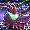
Just one last quickie before I leave for the field! She doesn't really have a story. I just wanted to try drawing a deer. with sword. She wants to D-D-D-D-D-D-D-DUEL!
...also I suck at drawing dresses and I'm pretty sure that's not the proper dueling stance.
...also I suck at drawing dresses and I'm pretty sure that's not the proper dueling stance.
Image size
1797x2783px 2.9 MB
Make
samsung
Model
SPH-L720T
Shutter Speed
1/24 second
Aperture
F/2.2
Focal Length
4 mm
ISO Speed
125
© 2017 - 2024 Jblask
Comments12
Join the community to add your comment. Already a deviant? Log In
Okay! Let's see here. (Please remember that this is my own opinion on this piece and that none of this is aimed to hurt or upset you. Thank you).
Overall I like the perspective of this piece, and the colors go together almost naturally. Nice work! I feel that the coloring in itself could be a tad neater. By this I mean that you can see white spots here and there, though if it's the pencil's fault (Prismacolor's tend to do so) I'd suggest using a blender. The black on the bottom of the dress could be sectioned a little better? By this I mean that perhaps you could fade the blue to black, or add stitching to where new types of fabric are present.
The hands and overall anatomy are good, considering that this is a cartoon art style that anatomy doesn't have to play a huge roll in the piece. My only concern is the right hand. Maybe add some more lighting to define the fingers?
The lineart could be a tad bit smoother, but nobody's perfect so that's okay! My other concerns are the little to no folds in the clothing as well as the tail.
When coloring/shading clothes you'll want to pay attention to how the body is positioned, and what fabric/type of clothing you're working with. In this case I'd assume the fabric would be rather thick for the skirt, and thin for the arm pieces and top. I think what you've added already is okay, but maybe adding a few more creases and folds near the legs/knees, hips, and creases in the arms would tie it together. If you need any help with it, try using Google or here to find some tips and tricks with drawing clothes. As for the shading (assuming that the lighting is coming from the character's right and is rather harsh) I'd suggest stretching the lights and shadows.
For the tail, it's just too spiky. On the bottom the fur would be more smooth with some ruffles. I'd suggest smoothing the top too just a little?
Also, when shading the tail, the shadows would most likely (in your case) be on the bottom of the tail, not the top. If it's on the top it looks like another light source is coming from the character's left and is only hitting the tail.
Overall I'd rate this piece a 7/10! I like this piece and think that it's really original. I hope you see this critique as a chance to improve and grow as an artist, and by no means did I intend this to be upsetting. And if it is, I'm sorry!
Have a good day/afternoon/night, and happy drawing!~